Don Quixote meets Who Framed Roger Rabbit in this slapstick epic about destiny, family demons, and revenge.
In 1911, in a hockey game in Quebec’s Gaspé Peninsula, local tough guy Billy Joe Pictou fires the puck into Monti Bouge’s mouth. When Monti collapses with his head across the goal line, Victor Bradley, erstwhile referee and local mailman, rules that the goal counts. Monti’s ensuing revenge for this injustice sprawls over three generations, one hundred years and dozens of alcohol-soaked tall tales, from treachery in northern gold-mining camps to the appearance of a legendary beast by turns playful and ferocious. It’s up to Monti’s grandson, François, to make sense of the vendetta between Monti and Bradley that has shaped the destiny of their town and everyone who lives there. In a sumptuous, unpredictable language and slapstick comedy, Christophe Bernard reveals himself as a master of epic storytelling.
Published by Biblioasis, April 2024
Art directed by Vanessa Stauffer
Process
There are multiple references to Metallica, who’s music matches the numerous and frenetic descriptions of fight scenes. In creating the first design below, I referenced the angular forms in Metallica’s logo while hand drawing the title. To complement the sharp lettering, I used a crude sketch of a beast as ‘devil driver’ on a snowmobile with a bottle of Yukon Gold to highlight the theme of alcohol-induced debauchery. The psychedelic color palette is in reference to the beast having “rainbow fur.”
In the next design I stretched the type to signify intoxication and illustrated a bottle of Yukon, which doubles as an inexhaustible well of revenge spanning multiple generations.
For the third design I obscured the title treatment within a forest of spades alluding to the elusive nature of the beast. The spades are connected to a surprise hand during a significant card game.
The fourth design is a recombination of elements used in the ‘rainbow beast’ and ‘forest of spades’ directions, using the vernacular from playing cards.
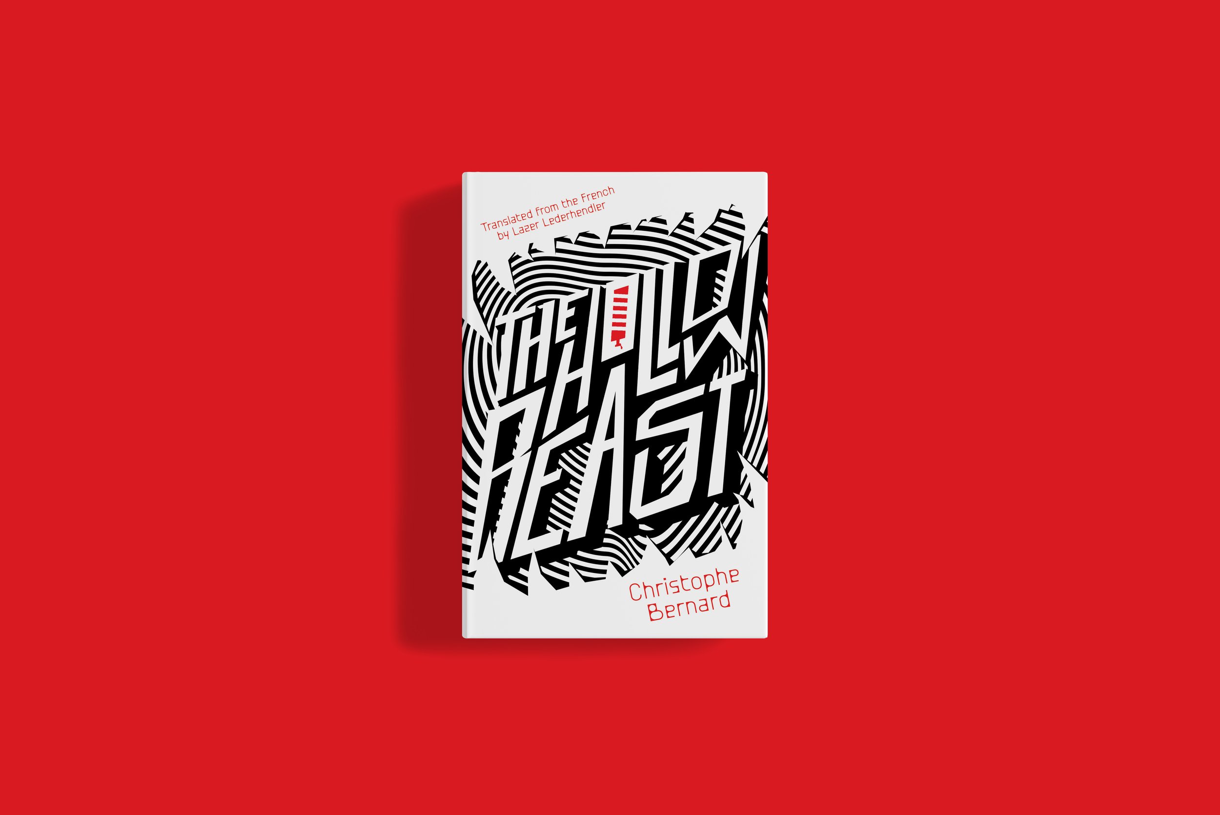
The final design, above, was inspired by the iconic “That’s all Folks!” title screen from Looney Tunes. The sharp, exaggerated forms mimic the slapstick energy in Bernard’s prose.


